About EventPASS
EventPass is a subscription based event discovery app that provides users with an affordable way to explore, find and attend events in their city as well as become event organizers in order to publish and manage their own events.
The challenge
Create an effective and intuitive dashboard experience that allows event organizers to create, edit and publish events as well as manage pre/post event activity and monetary transactions. The client was looking for a prototype that could serve and an MVP to help garner stakeholder financial support.
Team & Deliverables
Team
Hanyu Zhang
UX DesignerKerry Beasley
User ResearcherKirstie Espiritu
UX DesignerChris Jimenez
UX Designer
responsibilites
Conduct generative research
Facilitate user interview
Develop user centered design artifacts
Sketching, wireframing & prototyping
Visual Design
deliverables
Develop an MVP that allows users to:
Create an organizer profile and sign in
Create and post events, update details
Share events to social media
Track event day activities
Manage transactions for event purchases
Project time: 8 weeks
Research
methods of research
The first step to achieving our main goal was to gain a better understanding of the client’s request, the product, the industry, and the users who would benefit from the product. To do so, we implemented the following methods of research:
Client Interviews
Competitor Analysis
User Interviews
Client Interview take aways
Eventpass is a subscription based event discovery app where users gain access events in their city.
The payment model is monthly subscription plan.
Eventpass buys tickets in advance from event organizers to create vacancies for their subscribers.
Users can become event attendees as well as event organizers.
Event organizers can create events for free.
The dashboard is a desktop platform and will not be optimized for mobile.
Competitor analysis takeaways
To understand the competition, we compared competitors in order to learn what is currently being done and what is not being done in the market place.
user interviews
We then interviewed 6 event organizers to better understand the event planning process and dashboard experience from their perspective.
Participants
A Self-Employed Event Guide
An IT Specialist
A Dating Service Owner
A Public Relations Professional
A Visual Coordinator
A Chief Creative Officer/ Company Founder
Analysis
Information Synthesis
After the interviews, we synthesized our data and began to look for patterns and outstanding user needs and problems with the current event planning process. We learned the following:
Devices
All organizers relied heavily on laptops & desktops to create events.
Social Media
Few organizers found social media integration in their event apps helpful.
Age
Organizers ages 24-38 use digital event tools more than users over 40.
Dashboard
The dashboard experience was a quick and easy process for the organizers.
Event Creation Form
Missing options in event forms led to problems at the event for a few organizers.
Apps
All organizers use multiple apps to create and manage their events.
Features
All organizers left their main event creation app because of a missing feature.
Feedback
Few organizers found event feedback on social media to be important to event creation.
Price
Few organizers expressed upset over being charged to create events.
Tech Savvy
Technological proficiency influences the event organization process greatly.
Design Direction
Based on what we learned in the research phase, we established the following design direction that would help create an effective and intuitive dashboard experience.
Features
UI
The product must have a minimalist user interface
Ticketing
EventPass-specific ticketing system should be tailored to the subscription-based model
Rating system
Must include an attendee & organizer Rating System
Categorization
Organization via event category/niche
Customization
Customizable-within-reason event page design (artwork, fonts, color, video)
Engagement
Pre-event engagement on event page for attendees
Follow-Up
Follow-up notification for after event
Personas
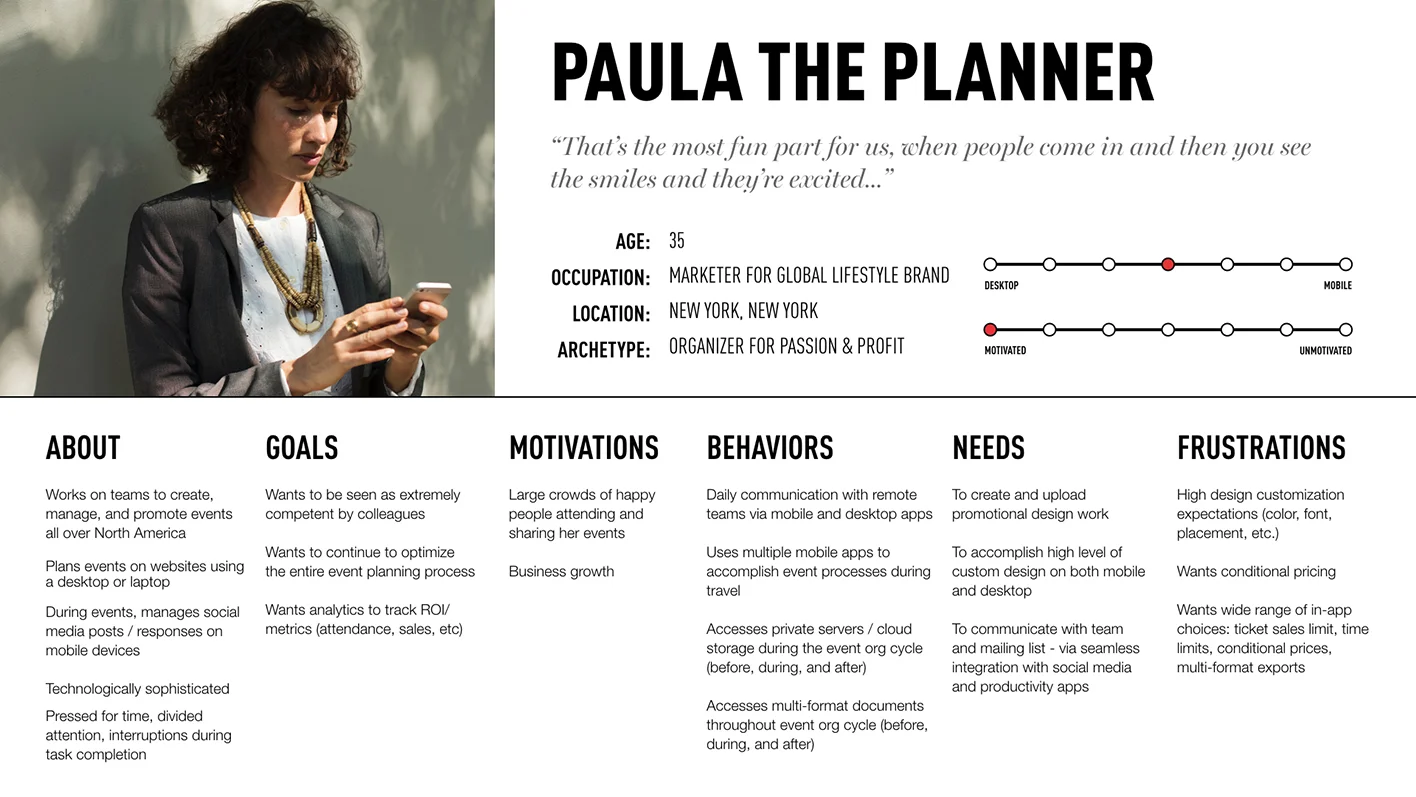
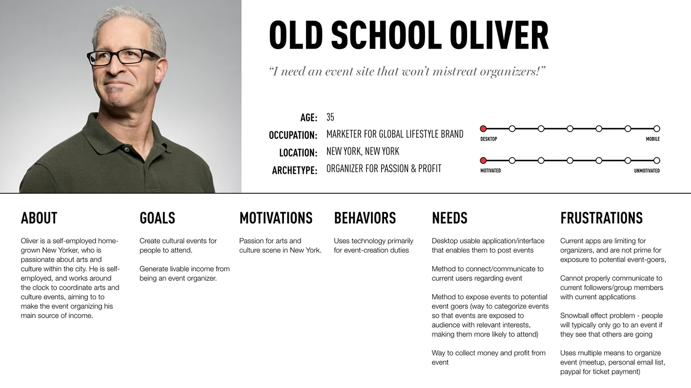
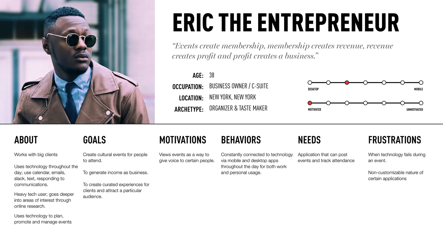
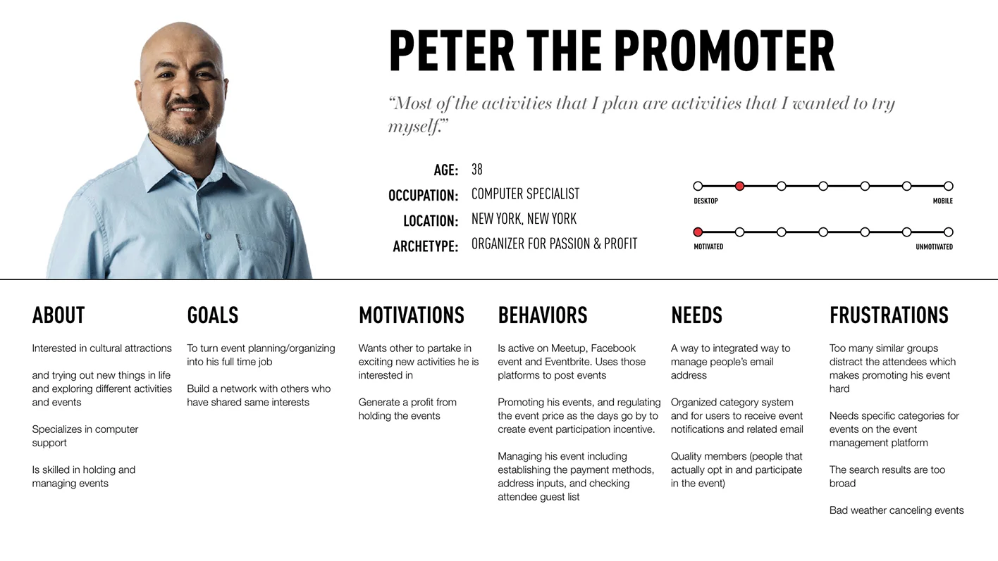
From the user interview data, we developed 4 personas to help us create user flows that are based on actual user insights and not assumptions.


user journey map
We then created a user journey map that visualized each personas user flow throughout key stages of their current event planning process. The map would helps us design the product around their current workflow.
Site Map
We then used the user journey map to help us create a site map that addresses the key event planning tasks and interactions shown in each persona’s user flow.
Sketches
We then began sketching page designs while referring to our analytical data and the user journey and site maps for guidance. Because we learned that event organizers utilize laptops & desktops to create events , we focused on designing a dashboard experience for desktop.
Dashboard
The dashboard works as an entry point from which users can access the tools they need to create and manage events.
Metrics
The metrics portion allows the user to keep track of past, present and future event data. We explored designs that would feel familiar and intuitive and allowing for the visualization of data needed by then such as RSVP confirmations and time tables.
Calendar
The calendar is a way for event organizers to view previous, current and future events they have created.
Wireframes
We then used Sketch to create the wireframes based on the approved sketches. As we designed, we came across 3 different design and task flow approaches. We decided that we would prototype and test them in the usability test stage to determine which features benefited the user and met the product requirements. We then imported the wireframe screens into InVision and built the prototypes.
option A
Dashboard Landing Page
Upon entering the site as a member, users can create, manage and analyze their events. Clicking “Dashboard” or the logo takes users back to this page.
Event Creation
During the interview process, Users expressed wanting more control in the event creation process including being able to upload and edit event artwork.
Click to Enlarge Image
Manage Events
Clicking on “Manage Events” from the sidebar menu displays live, future and past events in list format as well as a calendar view page. Search results can be refined using the filter or search bar.
Analytics
The “Analytics” tab allows users to view live, future and past events analytical data. Based on our research, we included the following data for event organizers:
Attendee names & photos
Waitlist
RSVP statuses
Tickets distributed
RSVP & check-in times
Total number of check-ins
Click to Enlarge Image
User Account & Settings
Clicking “Settings” in the header take users to their account and organizer settings page which they can edit to suit their preferences
option b
Homepage
From the homepage a new user could register to create a new account. As member they would be able to use the top navigation to:
Create & manage events
Review event data
Access their account settings
Account Creation
Entering an email address from the home screen would initiate the account creation process by having the user enter their information into a form.
Event Creation
Clicking “Event” from the top navigation leads to an event creation form similar to prototype A.
Events Calendar & List View
Clicking on “Reports” from the top navigation menu opens a calendar page displaying all of the events for the current month and year. The user can view past and future events via a year, month and key word filters. Users can also narrow their results by adjusting the filter parameters.
Option C
Homepage & Login
The user could login or sign up from the homepage. This option featured a pop login box the user could use upon entering the site.
Account Creation
Choosing sign up from the home page would initiate the registration process by opening an account creation page.
Calendar & List View
Logging in to the site as a member leads the user to the event calendar page which they can view in list format.
Event Creation
Clicking the “create an event” button in the event calendar will take users to an event creation form. After filling out the form, users can preview and publish their event.
Event Reports
Within the event calendar, users can click on a date featuring an event and view the event’s analytical data.
Usability testing
We recruited 3 event organizers to test the prototype. Afterwards we created a task script for each prototype that helped us guide the participants through the usability test sessions.
Test Results
Features
Users felt that both prototypes needed a larger font size to enhance readability.
Some users expected a drop down menu to appear under “my account”.
Some users didn’t understand the icons used in both prototypes.
Dashboard
Users wanted to see a concise minimalist dashboard that included “snippets” of information on upcoming events notifications, tasks, alerts and toolbars.
Users wanted to see a dashboard recognized them and felt welcoming
Event Creation
Some users wanted to be able to share or email the event post to others
Some users wanted more control of what and how basic event information was displayed to potential attendees
Analytics
Some users preferred that metrics be accessible to the organizer within an event post through, rather than a separate page existing
Users liked being able to see the total ticket sales metrics
Manage Events
Some users preferred the calendar (grid view) on and others preferred the “list view” format”
Some users wanted “contextual hover states” to be available to read statistical information on graphs and charts
Suggestions
Users stated that a website use of color and approach minimalism are to them
Some users expressed that potential attendees do not read information anymore and that the use of photography is the only way to show prospects how great an event will be
Revisions
After analyzing the test results we decided to combine all three prototypes into one. From there we then applied the user feedback and suggestions to the consolidated prototype.
Dashboard Redesign
We realized that none of the prototypes looked like a dashboard. We recalled that a test participant said that “snippets” of information are important to them. We then redesigned the homepage to feature windows into each of the feature’s most recent activity or updates to create the dashboard.
Messages
Being able to be in touch with attendees was very important to the test participants. To address this, we designed & incorporated a messaging component that allows registered Eventpass organizers & attendees to use.
Visual Design
Style tile
Event organizers need information to stand out in short span of time, we created a minimalist visual design that allows the eye easily navigate and identify key information with the following design elements.
San serif type face
Saturated primary & tertiary color palettes
Neutral tones
“Flat” UI and graphic elements
Semi contextual hover overlays
Click to Enlarge Image
High Fidelity
With the revised consolidated prototype and style tile complete, we applied the visual design to the prototype.
Dashboard
Event organizers told us that weather is the biggest obstacle in the way of a successful event. To help organizers plan better, the finalized dashboard features tells them the current weather and temperature based on their location.
Event Post & Analytics
We incorporated we’ve added an event’s analytical information to it’s original post which only the organizer can see. Attendee age & gender demographic information has also been incorporated to the analytical information available to the organizer.
Event post preview
Organizers can preview what their event post will look like on mobile phones to ensure everything is in order before publishing their event.
Event creation form
The final event information form features features that were important to event organizers that we interviewed. A keyword input field was incorporated into the form to help event organizers increase their event’s visibility in user searches.
Inbox & Messaging
We incorporated the ability to reply to messages from within the messaging component. We assigned bright reds from the style tile color palette to the “compose message” and “send” buttons to help them stand out.
Event Calendar
The event calendar uses bright reds to highlight events scheduled in the calendar and the current month that is being viewed. The list view uses red to highlight dates and past, today & future event filters.
Client Presentation
We presented the MVP to the client. The product was well received by the client. They were satisfied with the MVP and expressed that it met the product requirements and felt they had an MVP that they could present to stake holders.


